Statistics (relevant for 6Q4 80)
ai explains how to interpret data presented in a pie graph based on an image
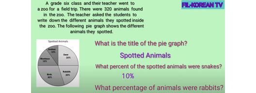
To understand a pie graph, imagine it as a big pizza divided into slices. Each slice shows a part of the whole pizza. In the pie graph titled "Spotted Animals," each slice represents a different type of animal the students saw at the zoo. The size of each slice tells us how many of each animal there were compared to the others.
For example, the "Birds" slice is the largest, taking up 30% of the pie. This means that out of all the animals spotted, birds were the most common. If there were 320 animals in total, you can find out how many birds there were by calculating 30% of 320. Similarly, the "Snakes" slice is 10%, which means snakes were less common. By looking at the pie graph, you can quickly see which animals were seen the most and the least.
