Statistics (relevant for 6Q4 80)
ai swaps categories in a pie chart
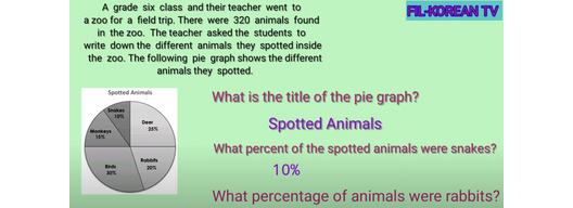
Let's learn how to read a pie graph by looking at favorite activities! Imagine a class of students who were asked about their favorite activities. The pie graph shows the results:
- Soccer (formerly Snakes) is loved by 10% of the students.
- Basketball (formerly Monkeys) is chosen by 15%.
- Swimming (formerly Birds) is the favorite for 30%.
- Dance (formerly Rabbits) is enjoyed by 20%.
- Gaming (formerly Deer) is the top choice for 25%.
Each slice of the pie graph represents a different activity, and the size of each slice shows how popular that activity is among the students. The bigger the slice, the more students like that activity. For example, Swimming has the biggest slice, meaning it's the most popular activity.
